在底部导航栏这个模块,很多时候默认的样式不符合我们的设计规范和需求,因此需要自定义底部导航栏,这样可以满足我们的需求,也可以更加个性化,增加用户体验,下面就介绍如何自定义底部导航栏。
# 目录
- 准备导航素材
- 配置页面导航
- 自定义导航栏
# 准备导航素材
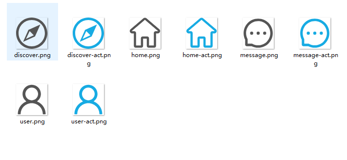
要自定义底部导航栏,我们需要到 iconfont 上面找一些常用的图标,然后保存成图片,存到本地图片文件夹下面。
下面是我准备的一个图标图片文件。
# 配置页面导航
接下来开始进行配置,先在pages.json文件里面配置好默认底部导航栏。
{
  "pages": [
    //pages数组中第一项表示应用启动页,参考:https://uniapp.dcloud.io/collocation/pages
    {
      "path": "pages/index/index",
      "style": {
        "navigationBarTitleText": "首页"
      }
    },
    {
      "path": "pages/message/index",
      "style": {
        "navigationBarTitleText": "消息"
      }
    },
    {
      "path": "pages/discover/index",
      "style": {
        "navigationBarTitleText": "发现"
      }
    },
    {
      "path": "pages/user/index",
      "style": {
        "navigationBarTitleText": "我的"
      }
    }
  ],
  "globalStyle": {
    "navigationBarTextStyle": "white",
    "navigationBarTitleText": "HelloApp",
    "navigationBarBackgroundColor": "#333",
    "backgroundColor": "#f8f8f8"
  },
  "tabBar": {
    "borderStyle": "white",
    "backgroundColor": "#fff",
    "color": "#555",
    "selectedColor": "#24afd6",
    "list": [
      {
        "text": "首页",
        "pagePath": "pages/index/index",
        "iconPath": "static/image/icon/home.png",
        "selectedIconPath": "static/image/icon/home-act.png"
      },
      {
        "text": "消息",
        "pagePath": "pages/message/index",
        "iconPath": "static/image/icon/message.png",
        "selectedIconPath": "static/image/icon/message-act.png"
      },
      {
        "text": "发现",
        "pagePath": "pages/discover/index",
        "iconPath": "static/image/icon/discover.png",
        "selectedIconPath": "static/image/icon/discover-act.png"
      },
      {
        "text": "我的",
        "pagePath": "pages/user/index",
        "iconPath": "static/image/icon/user.png",
        "selectedIconPath": "static/image/icon/user-act.png"
      }
    ]
  }
}
1
2
3
4
5
6
7
8
9
10
11
12
13
14
15
16
17
18
19
20
21
22
23
24
25
26
27
28
29
30
31
32
33
34
35
36
37
38
39
40
41
42
43
44
45
46
47
48
49
50
51
52
53
54
55
56
57
58
59
60
61
62
63
64
65
66
67
2
3
4
5
6
7
8
9
10
11
12
13
14
15
16
17
18
19
20
21
22
23
24
25
26
27
28
29
30
31
32
33
34
35
36
37
38
39
40
41
42
43
44
45
46
47
48
49
50
51
52
53
54
55
56
57
58
59
60
61
62
63
64
65
66
67
# 自定义导航栏
有时候我们需要定制化的需求,使用默认底部导航栏就不那么容易更改,所以这次使用自定义导航栏。
# 新建自定义导航栏组件
这里使用公共组件的形式自定义导航栏,可能会牺牲一些性能。
- 新建
q-tabbar文件夹; - 新建
q-tabbar.vue组件;
# html 部分
<view class="q-tabbar" :style="{'backgroundColor': props.bgColor, 'borderColor': props.borColor}">
  <view
    :class="{'q-tabbar-item': true, 'active': props.current == item.id}"
    v-for="item in qTabbar.list"
    :key="item.id"
    @click="toggleNav(item)">
    <q-icon
      class="q-tabbar-icon"
      :name="item.icon"
      :size="20"
      :color="`${props.current == item.id ? props.activeColor : props.color}`"
      v-if="props.showIcon" />
    <text
      class="q-tabbar-text"
      :style="{'color': `${props.current == item.id ? props.activeColor : props.color}`}"
      v-if="props.showText"
      >{{item.name}}</text
    >
  </view>
</view>
1
2
3
4
5
6
7
8
9
10
11
12
13
14
15
16
17
18
19
20
2
3
4
5
6
7
8
9
10
11
12
13
14
15
16
17
18
19
20
# css 部分
.q-tabbar {
  position: fixed;
  bottom: 0;
  left: 0;
  display: flex;
  justify-content: space-around;
  align-items: center;
  box-sizing: border-box;
  padding: 12rpx 0;
  width: 100%;
  height: $tabBarHei;
  border-top: 2rpx solid;
  z-index: 99;
  .q-tabbar-item {
    flex: 1;
    text-align: center;
    font-size: 24rpx;
  }
}
1
2
3
4
5
6
7
8
9
10
11
12
13
14
15
16
17
18
19
2
3
4
5
6
7
8
9
10
11
12
13
14
15
16
17
18
19
记得在uni.scss加上变量:
/* 首页变量 */
$mainColor: #24afd6;
$iptBorColor: #999;
$f8: #f8f8f8;
$e: #eee;

// 全局变量
$tabBarHei: 120rpx; // 底部导航高度
1
2
3
4
5
6
7
8
2
3
4
5
6
7
8
# js 部分
import { reactive } from "vue";
import { onLoad } from "@dcloudio/uni-app";

const qTabbar = reactive({
  list: [
    {
      id: 1,
      name: "首页",
      icon: "home",
      url: "/pages/index/index",
    },
    {
      id: 2,
      name: "消息",
      icon: "message",
      url: "/pages/message/index",
    },
    {
      id: 3,
      name: "发现",
      icon: "discover",
      url: "/pages/discover/index",
    },
    {
      id: 4,
      name: "我的",
      icon: "user",
      url: "/pages/user/index",
    },
  ],
});

const props = defineProps({
  // 当前导航
  current: {
    type: Number,
    default: 1,
  },
  // 文字颜色
  color: {
    type: String,
    default: "#999",
  },
  // 活动颜色
  activeColor: {
    type: String,
    default: "#fff",
  },
  // 背景色
  bgColor: {
    type: String,
    default: "#333",
  },
  // 边框色
  borColor: {
    type: String,
    default: "#e3e3e3",
  },
  // 显示文字
  showText: {
    type: Boolean,
    default: true,
  },
  // 显示图标
  showIcon: {
    type: Boolean,
    default: true,
  },
});

// 发送消息
const emits = defineEmits(["change"]);

// 方法

// 加载
onLoad(() => {
  uni.hideTabBar();
});

// 切换导航
function toggleNav(item) {
  uni.switchTab({
    url: item.url,
    success() {
      emits("change", item);
    },
  });
}
1
2
3
4
5
6
7
8
9
10
11
12
13
14
15
16
17
18
19
20
21
22
23
24
25
26
27
28
29
30
31
32
33
34
35
36
37
38
39
40
41
42
43
44
45
46
47
48
49
50
51
52
53
54
55
56
57
58
59
60
61
62
63
64
65
66
67
68
69
70
71
72
73
74
75
76
77
78
79
80
81
82
83
84
85
86
87
88
89
2
3
4
5
6
7
8
9
10
11
12
13
14
15
16
17
18
19
20
21
22
23
24
25
26
27
28
29
30
31
32
33
34
35
36
37
38
39
40
41
42
43
44
45
46
47
48
49
50
51
52
53
54
55
56
57
58
59
60
61
62
63
64
65
66
67
68
69
70
71
72
73
74
75
76
77
78
79
80
81
82
83
84
85
86
87
88
89
# 引入自定义导航栏组件
上次介绍过如何注册和使用全局公共组件,那么就不在需要全局引入了,直接在需要的底部导航页使用组件即可。
- 一般用法
<q-tabbar :current="1" />
1
- 监听切换操作
<q-tabbar :current="1" @change="changeNav" />
1
// 改变导航
function changeNav(item) {
  console.log("底部导航:", item);
}
1
2
3
4
2
3
4
current就是当前导航的序号。
changeNav获取导航改变的方法。
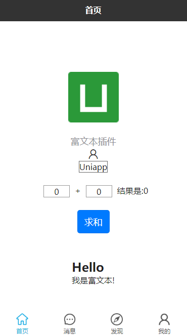
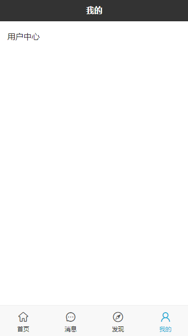
# 预览
看一下自定义的效果吧,这次采用图标显示,更加节省体积大小。
# 最后
以上就是自定义底部导航栏的主要内容,如有不足之处,请多多指正。


