本篇主要讲述如何自定义顶部导航栏,有时候默认导航栏不足以满足我们的需求,这时候就需要自定义导航栏来解决这个问题。
# 目录
- 默认导航
- 修改配置
- 自定义顶部
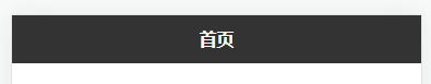
# 默认导航
自带的默认顶部导航设置的内容有限,不容易扩展修改,因此如果有更加个性化的需求,则需要自定义顶部导航。
配置如下:
"globalStyle": {
    "navigationBarTextStyle": "white",
    "navigationBarTitleText": "HelloApp",
    "navigationBarBackgroundColor": "#333",
    "backgroundColor": "#f8f8f8"
}
1
2
3
4
5
6
2
3
4
5
6
更多配置查看:https://uniapp.dcloud.net.cn/collocation/pages.html#globalstyle (opens new window)
# 修改配置
在pages.json文件中的globalStyle加一个配置。
"globalStyle": {
    "navigationBarTextStyle": "white",
    "navigationBarTitleText": "HelloApp",
    "navigationBarBackgroundColor": "#333",
    "backgroundColor": "#f8f8f8",
    "navigationStyle": "custom"
}
1
2
3
4
5
6
7
2
3
4
5
6
7
这样我们就可以自定义顶部导航了。
# 自定义顶部
# 使用官方插件
基本用法如下:
<uni-nav-bar left-icon="left" right-icon="cart" title="标题" left-text="返回" right-text="设置" />
1
# 自己编写组件
有时候官方的自定义顶部导航可能还是达不到我们的需求,这时候可以自己编写一个自定义顶部导航组件,更加灵活高效。
# 编写组件
在components下面新建文件夹q-navbar和文件q-navbar.vue。
- html 部分
这部分就是使用flex布局的一个导航,里面是否绑定了很多父组件的消息,可以自定义左边、中间、右边的图标、名称和是否显示。
还有一个特色就是如果不想使用默认的,可以使用slot插槽自己写适合自己的那块内容。
<view
  class="q-navbar"
  :style="{'color': props.color,  'backgroundColor': props.bgColor, 'border-bottom': `2rpx solid ${props.borColor}`}">
  <slot name="navbar">
    <view class="q-navbar-left">
      <slot name="left">
        <view class="q-navbar-item" @click="clickSet('left')" v-if="props.left.show">
          <q-icon
            class="q-navbar-icon"
            :name="props.left.icon"
            :size="18"
            color="#333"
            v-if="props.left.icon" />
          <text class="q-navbar-text" v-if="props.left.name">{{props.left.name}}</text>
        </view>
      </slot>
    </view>
    <view class="q-navbar-center">
      <slot name="center">
        <view class="q-navbar-item" @click="clickSet('center')" v-if="props.center.show">
          <q-icon
            class="q-navbar-icon"
            :name="props.center.icon"
            :size="18"
            color="#333"
            v-if="props.center.icon" />
          <text class="q-navbar-text" v-if="props.center.name">{{props.center.name}}</text>
        </view>
      </slot>
    </view>
    <view class="q-navbar-right">
      <slot name="right">
        <view class="q-navbar-item" @click="clickSet('right')" v-if="props.right.show">
          <q-icon
            class="q-navbar-icon"
            :name="props.right.icon"
            :size="18"
            color="#333"
            v-if="props.right.icon" />
          <text class="q-navbar-text" v-if="props.right.name">{{props.right.name}}</text>
        </view>
      </slot>
    </view>
  </slot>
</view>
1
2
3
4
5
6
7
8
9
10
11
12
13
14
15
16
17
18
19
20
21
22
23
24
25
26
27
28
29
30
31
32
33
34
35
36
37
38
39
40
41
42
43
44
45
2
3
4
5
6
7
8
9
10
11
12
13
14
15
16
17
18
19
20
21
22
23
24
25
26
27
28
29
30
31
32
33
34
35
36
37
38
39
40
41
42
43
44
45
- 样式部分
.q-navbar {
  position: fixed;
  top: 0;
  left: 0;
  display: flex;
  justify-content: space-around;
  align-items: center;
  box-sizing: border-box;
  padding: 0 30rpx;
  width: 100%;
  height: $navBarHei;
  background: $f8;
  .q-navbar-item {
    display: flex;
    align-items: center;
    width: 100%;
    .q-navbar-icon {
      padding: 0 5rpx;
    }
    .q-navbar-text {
      margin-left: 10rpx;
    }
  }
  .q-navbar-left,
  .q-navbar-right {
    max-width: 120rpx;
    width: 100%;
  }
  .q-navbar-left {
    .q-navbar-item {
      justify-content: flex-start;
    }
  }
  .q-navbar-right {
    .q-navbar-item {
      justify-content: flex-end;
    }
  }
  .q-navbar-center {
    flex: 1;
    text-align: center;
    .q-navbar-item {
      justify-content: center;
    }
  }
}
1
2
3
4
5
6
7
8
9
10
11
12
13
14
15
16
17
18
19
20
21
22
23
24
25
26
27
28
29
30
31
32
33
34
35
36
37
38
39
40
41
42
43
44
45
46
2
3
4
5
6
7
8
9
10
11
12
13
14
15
16
17
18
19
20
21
22
23
24
25
26
27
28
29
30
31
32
33
34
35
36
37
38
39
40
41
42
43
44
45
46
在uni.scss里面加入:
$navBarHei: 110rpx; // 顶部导航栏高度
1
- js 部分
主要是传递数据,可以根据按钮绑定的事件进行处理。
const props = defineProps({
  // 文字颜色
  color: {
    type: String,
    default: "#333",
  },
  // 背景色
  bgColor: {
    type: String,
    default: "#f8f8f8",
  },
  // 边框色
  borColor: {
    type: String,
    default: "#e3e3e3",
  },
  // 左边配置
  left: {
    type: Object,
    default() {
      return {
        name: "", // 导航名称
        icon: "arrow-line-left", // 图标名称
        url: "", // 页面地址
        isTabbar: false, // 是否导航页面
        type: "click", // 点击类型:click默认,self自定义
        show: true, // 是否显示
      };
    },
  },
  // 中间配置
  center: {
    type: Object,
    default() {
      return {
        name: "首页",
        icon: "",
        url: "",
        isTabbar: false,
        type: "click",
        show: true,
      };
    },
  },
  // 右边配置
  right: {
    type: Object,
    default() {
      return {
        name: "",
        icon: "more",
        url: "",
        isTabbar: false,
        type: "click",
        show: true,
      };
    },
  },
});

// 发送消息
const emits = defineEmits(["change"]);

// 方法

// 点击设置
function clickSet(from = "center") {
  let info = props[from];
  info.from = from;
  if (info.type == "click") {
    let url = info.url;
    if (!url) {
      uni.navigateBack({
        delta: 1,
      });
      return;
    }
    if (info.isTabbar) {
      uni.switchTab({
        url: info.url,
      });
    } else {
      uni.navigateTo({
        url: info.url,
      });
    }
  } else {
    emits("change", info);
  }
}
1
2
3
4
5
6
7
8
9
10
11
12
13
14
15
16
17
18
19
20
21
22
23
24
25
26
27
28
29
30
31
32
33
34
35
36
37
38
39
40
41
42
43
44
45
46
47
48
49
50
51
52
53
54
55
56
57
58
59
60
61
62
63
64
65
66
67
68
69
70
71
72
73
74
75
76
77
78
79
80
81
82
83
84
85
86
87
88
89
90
2
3
4
5
6
7
8
9
10
11
12
13
14
15
16
17
18
19
20
21
22
23
24
25
26
27
28
29
30
31
32
33
34
35
36
37
38
39
40
41
42
43
44
45
46
47
48
49
50
51
52
53
54
55
56
57
58
59
60
61
62
63
64
65
66
67
68
69
70
71
72
73
74
75
76
77
78
79
80
81
82
83
84
85
86
87
88
89
90
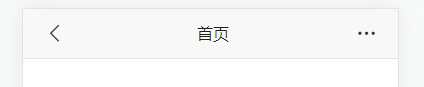
# 预览
# 最后
以上就是自定义顶部导航栏的主要内容,如有不足之处,请多多指正。


