有时候一个页面请求接口需要加载很长时间,这时候就需要一个加载页面来告知用户内容正在请求加载中,下面就写一个简单的自定义加载组件。
# 目录
- 准备工作
- 逻辑思路
- 实战演练
- 效果预览
# 准备工作
在之前的全局组件目录components下新建一个组件文件夹,命名为q-loading,组件为q-loading.vue。
再找几个效果不错的 css 加载动画,然后修改一下样式。
# 逻辑思路
# 编写模板部分
要求具有扩展性,因此可以使用slot插槽来插入内容,也方便后期修改自定义。
使用class和style绑定一些父组件传过来的值,更加个性化。
这个页面分为图标和文本提示两部分,各自可以自定义显示、大小、颜色。
# 编写样式部分
这部分就是图标和文本的样式以及一些加载动画的内容。
# 编写脚本部分
这部分主要是父组件传递过来的参数,通过props进行制定格式。
# 实战演练
下面就简单实现一个加载组件。
# 模板部分
<view
  class="q-loading"
  :style="{'backgroundColor': props.bgColor}"
  v-if="props.show"
>
  <view class="q-loading-inner">
    <slot name="load">
      <!-- 图标部分 -->
      <view
        :class="{'q-loading-icon': true, 'pause': !props.show && !props.showIcon}"
        v-if="props.showIcon"
      >
        <slot name="icon">
          <!-- 圆环 -->
          <view
            class="q-loading-item q-loading-circle"
            :style="{'width': props.borSize +'rpx', 'height': props.borSize +'rpx', 'borderWidth': props.borWin + 'rpx', 'borderColor': props.borColor, 'borderLeftColor': props.bordActiveColor}"
            v-if="props.iconName == 'circle'"
          >
          </view>
          <!-- 呼吸 -->
          <view
            class="q-loading-item q-loading-circle-breath"
            v-if="props.iconName == 'circle-breath'"
          >
          </view>
          <!-- 旋转 -->
          <view
            class="q-loading-item q-loading-circle-round"
            v-if="props.iconName == 'circle-round'"
          >
            <view
              class="loading-round"
              :style="{'backgroundColor': props.bordActiveColor}"
            ></view>
            <view
              class="loading-round"
              :style="{'backgroundColor': props.bordActiveColor}"
            ></view>
            <view
              class="loading-round"
              :style="{'backgroundColor': props.bordActiveColor}"
            ></view>
            <view
              class="loading-round"
              :style="{'backgroundColor': props.bordActiveColor}"
            ></view>
            <view
              class="loading-round"
              :style="{'backgroundColor': props.bordActiveColor}"
            ></view>
            <view
              class="loading-round"
              :style="{'backgroundColor': props.bordActiveColor}"
            ></view>
            <view
              class="loading-round"
              :style="{'backgroundColor': props.bordActiveColor}"
            ></view>
          </view>
        </slot>
      </view>
      <!-- 提示文本 -->
      <view
        class="q-loading-text"
        v-if="props.showText"
        :style="{'color': props.textColor, 'fontSize': props.textSize + 'rpx'}"
      >
        <slot name="text"> {{ props.text }} </slot>
      </view>
    </slot>
  </view>
</view>
1
2
3
4
5
6
7
8
9
10
11
12
13
14
15
16
17
18
19
20
21
22
23
24
25
26
27
28
29
30
31
32
33
34
35
36
37
38
39
40
41
42
43
44
45
46
47
48
49
50
51
52
53
54
55
56
57
58
59
60
61
62
63
64
65
66
67
68
69
70
71
72
73
2
3
4
5
6
7
8
9
10
11
12
13
14
15
16
17
18
19
20
21
22
23
24
25
26
27
28
29
30
31
32
33
34
35
36
37
38
39
40
41
42
43
44
45
46
47
48
49
50
51
52
53
54
55
56
57
58
59
60
61
62
63
64
65
66
67
68
69
70
71
72
73
# 样式部分
这部分就是页面的样式以及三个对应的动画。
- 页面的样式
.q-loading {
  position: fixed;
  top: 0;
  left: 0;
  display: flex;
  justify-content: center;
  align-items: center;
  box-sizing: border-box;
  padding: 10rpx;
  width: 100%;
  height: 100vh;
  .q-loading-inner {
    display: flex;
    flex-direction: column;
    justify-content: center;
    align-items: center;
    .q-loading-icon {
      display: flex;
      justify-content: center;
      align-items: center;
      margin-bottom: 10rpx;
      width: 100rpx;
      height: 100rpx;
      .q-loading-circle {
        border-radius: 50%;
        border-style: solid;
        animation: loadingCircle 1s linear infinite;
      }
      .q-loading-circle-breath {
        box-shadow: 0 0 0 0 rgb(204, 73, 152);
        height: 36px;
        width: 36px;
        border-radius: 50%;
        animation: loadingCircleBreath 1s linear infinite;
      }
      .q-loading-circle-round {
        position: relative;
        width: 75rpx;
        height: 75rpx;
        .loading-round {
          position: absolute;
          width: 26rpx;
          height: 26rpx;
          border-radius: 50%;
          animation: loadingCircleRound 3s ease infinite;
          transform-origin: 120% 80rpx;
          &.loading-round:nth-child(1) {
            z-index: 7;
          }
          &.loading-round:nth-child(2) {
            height: 12px;
            width: 12px;
            animation-delay: 0.2s;
            z-index: 6;
          }
          &.loading-round:nth-child(3) {
            height: 11px;
            width: 11px;
            animation-delay: 0.4s;
            z-index: 5;
          }
          &.loading-round:nth-child(4) {
            height: 10px;
            width: 10px;
            animation-delay: 0.6s;
            z-index: 4;
          }
          &.loading-round:nth-child(5) {
            height: 9px;
            width: 9px;
            animation-delay: 0.8s;
            z-index: 3;
          }
          &.loading-round:nth-child(6) {
            height: 8px;
            width: 8px;
            animation-delay: 1s;
            z-index: 2;
          }
          &.loading-round:nth-child(7) {
            height: 7px;
            width: 7px;
            animation-delay: 1.2s;
            z-index: 1;
          }
        }
      }
      &.pause {
        .q-loading-item {
          animation-play-state: paused;
        }
      }
    }
  }
}
1
2
3
4
5
6
7
8
9
10
11
12
13
14
15
16
17
18
19
20
21
22
23
24
25
26
27
28
29
30
31
32
33
34
35
36
37
38
39
40
41
42
43
44
45
46
47
48
49
50
51
52
53
54
55
56
57
58
59
60
61
62
63
64
65
66
67
68
69
70
71
72
73
74
75
76
77
78
79
80
81
82
83
84
85
86
87
88
89
90
91
92
93
94
95
2
3
4
5
6
7
8
9
10
11
12
13
14
15
16
17
18
19
20
21
22
23
24
25
26
27
28
29
30
31
32
33
34
35
36
37
38
39
40
41
42
43
44
45
46
47
48
49
50
51
52
53
54
55
56
57
58
59
60
61
62
63
64
65
66
67
68
69
70
71
72
73
74
75
76
77
78
79
80
81
82
83
84
85
86
87
88
89
90
91
92
93
94
95
- 三个对应的动画
// 圆环
@keyframes loadingCircle {
  0% {
    transform: rotate(0);
  }
  100% {
    transform: rotate(360deg);
  }
}

// 呼吸
@keyframes loadingCircleBreath {
  0% {
    transform: scale(0.3);
    box-shadow: 0 0 0 0 rgba(36, 175, 214, 60%);
  }

  60% {
    transform: scale(0.5);
    box-shadow: 0 0 0 56rpx rgba(36, 175, 214, 0%);
  }

  100% {
    transform: scale(0.3);
    box-shadow: 0 0 0 0 rgba(36, 175, 214, 0%);
  }
}

// 转动
@keyframes loadingCircleRound {
  to {
    transform: rotate(1turn);
  }
}
1
2
3
4
5
6
7
8
9
10
11
12
13
14
15
16
17
18
19
20
21
22
23
24
25
26
27
28
29
30
31
32
33
34
2
3
4
5
6
7
8
9
10
11
12
13
14
15
16
17
18
19
20
21
22
23
24
25
26
27
28
29
30
31
32
33
34
# 脚本部分
这部分就是传递的数据,包括组件、图标和文本的显示控制,以及各自的颜色,大小等参数。
const props = defineProps({
  // 显示加载
  show: {
    type: Boolean,
    default: true,
  },
  // 背景色
  bgColor: {
    type: String,
    default: "#fff",
  },
  // 显示图标
  showIcon: {
    type: Boolean,
    default: true,
  },
  // 名称
  iconName: {
    type: String,
    default: "circle",
  },
  // 大小
  borSize: {
    type: Number,
    default: 60,
  },
  // 边框粗细
  borWin: {
    type: Number,
    default: 8,
  },
  // 颜色
  borColor: {
    type: String,
    default: "#e3e3e3",
  },
  // 活动颜色
  bordActiveColor: {
    type: String,
    default: "#24afd6",
  },
  // 显示文本
  showText: {
    type: Boolean,
    default: true,
  },
  // 文本内容
  text: {
    type: String,
    default: "加载中...",
  },
  // 文本颜色
  textColor: {
    type: String,
    default: "#555",
  },
  // 文本大小
  textSize: {
    type: Number,
    default: 20,
  },
});
1
2
3
4
5
6
7
8
9
10
11
12
13
14
15
16
17
18
19
20
21
22
23
24
25
26
27
28
29
30
31
32
33
34
35
36
37
38
39
40
41
42
43
44
45
46
47
48
49
50
51
52
53
54
55
56
57
58
59
60
61
62
2
3
4
5
6
7
8
9
10
11
12
13
14
15
16
17
18
19
20
21
22
23
24
25
26
27
28
29
30
31
32
33
34
35
36
37
38
39
40
41
42
43
44
45
46
47
48
49
50
51
52
53
54
55
56
57
58
59
60
61
62
# 效果预览
下面看一下预览效果吧。
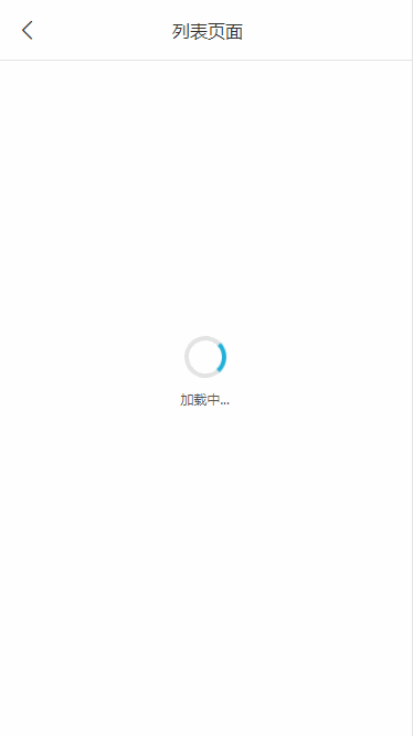
# 圆环效果
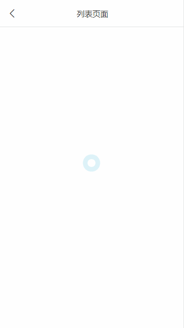
# 呼吸效果
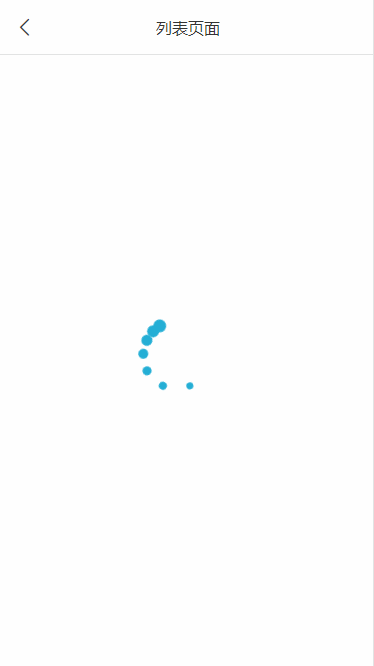
# 旋转效果
# 最后
以上就是自定义加载组件的主要内容,有不足之处,请多多指正。


